Saturday, 28 April 2012
-
My evaluation questions are in a different order to those in my booklet. This is because of the different means of media i have used, so some posts took longer to upload than others.
Q- How did you attract and address your audience?
I took a video of a friend who had the characteristics of my target audience, i asked him about his first thoughts upon seeing my magazine
Q- What Kind Of Media Institution May Distribute Your Product?

You would want a successful company distributing the product. After previously looking at media institutions, i found that 'Bauer' have been extremely successful at producing and distributing magazines.They are one of the biggest organisations in this industry with headquarters in many countries.Magazines of a similar genre to mine have been distributed by this company. An example of this could be 'Kerrang'. This would add to the reason as to why i think this would be a good company to distribute my magazine. I think this would be the best choice because this company distributes a wide range of both niche and broadcast magazines, it would have the experience and ability to distribute mine. The fact that they bring at least 38 million magazines to life per week.

Another approach to distributing the magazine could be through the internet. Magazines often have websites where readers can interact with the magzine, read more and put their opinion across. Having a website for the magazine also provides the opportunity for readers to subscribe, these can often be seen in pop ups or beside an offer to get something free if you do.

Social Networking sites would allw readers to talk to other readers. You can set up a account or page dedicated to the magazine and be able to directly tell fans or people who come across the site about the next issues exclusive interview, freebies or subscription offers. It would be a great way to target my audience as teenagers are known for their constant networking!

Finally, another great place to distribute a magazine is in a news agents or shop. Places such as WHSmith are known for selling almost everykind of magazine there is, and thousands of people go to supermarkets such as Asda every day.
Thursday, 26 April 2012


Monday, 23 April 2012
35. Final draft - Double Page Spread

34. Final Draft - Contents

33. Final Draft - Cover

Thursday, 19 April 2012
32. Second Draft - Double Page Spread

I feel as though i have made better use of the space on the pages. This is because i have moved the title; 'Your Festival Guide' to the centre of the page, whilst moving the festival features around it.
To heighten the idea of my magazine relating to a Scrap Book, i changed the back ground to a brown, arty looking piece of paper. I think this works well. In addition i think that it looks like my artical is personal, because of the scrapbook theme and because i have chosen a font that looks like hand writing.
When doing my second draft i found that the layout meant i had to comprimise. I had to get rid of the 'your vote' box and also the twitter and facebook icons.
I think that this draft can easily be related to Indie style, the colours and font have connotations of the genre.
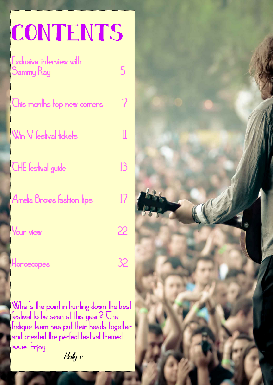
31. Second Draft - Contents

I have changed the colour scheme however, this is because i felt that the pinks and purples used in my first draft were too feminine and didn't relate very well to my genre.
I have also made the box slightly translucent, i think this allows you to view the contents all as one piece, rather than just a picture and list. I have also added the magazine website to the contents page, this is because i noticed it in a magazine i annalysed.
In addition, i have changed the background picture. I didnt want the cover and contents images to look the same so i chose this one. I like the idea seeing my model from the front and then the back.
To improve i would try to brighten the picture some more. When i took it the weather was bad so the lighting is awful. I would also try to make the title 'Contents' stand out more.
30.Second Draft - Front Cover

I chose a wooded are as a background because it reminds me of music festivals. I also remembered that Indie music fans are stereotypically out going so i thought it would be best to take my photos out side.
So that the magazine looks professional, i chose a clear colour scheme and made sure that the font was continuous. In addition i have also added a barcode and the date of the magazines release in corners of the cover.
Ive placed the text where it is due to my background, although most of it is on the left side i feel that it balances it out so that the cover doesnt look too busy.
Wednesday, 18 April 2012
29. First Draft - Double Page Spread

Its was obvious that i had to continue the colour scheme i has used throughout, so i picked similar colours to my contents and cover. However i wanted my back ground to be quirky, so i chose a mint green that had a crinkled tissue paper effect. In addition i also used the fonts that i had included in my other pieces.
For continuity i made sure that i included the grey i used in the title on the first page, on the second page too, i feel as though it makes it look professional.
I felt that it was important to include logo's of festival in this, this is because i know that readers can look at the pages and know what the article is about without having to read it through.
So that it was visually appealing i ensured that i used plenty of images, this will catch the readers attention and reflect the feel that i want my magazine to have.
On my second draft i want to improve how the text is layed out.
Thursday, 12 April 2012
28. First Draft Contents edited
When taking a few more original photos, i decided to include some with my model holding a guitar. This is because i used it in my first draft and decided that it provided an obvious link to chosen genre.

27. First draft Contents
This is my first attempt at a contents page. I decided that it would be easier to complete the rest of my work on publisher, this is because i do not have a 'Mac' at home.
The background is an image of a male indie singer, playing his guitar to a large festival audience. I liked how the artist was the focal point of the image and how the audience was blurred. I felt that this would work well alongside the contents and uptain the quirky character that i wanted the magazine to have. I designed the contents so that it was in an orderly list down the left hand side of the page, this not only makes is easy for readers to identify what is included in the magazine, but also keeps inline with the 'sleek' theme i wanted it to have.
To ensure that there was continuity, i made certain that i carried on the colour scheme i used on the cover, this makes the magazine look professional and orderly. Secondly i made sure that i used the same font that i used for my title as i did writing 'contents'.
When writing what was included in the magazine i looked back at the Focus Groups i had done previously. The questions i asked provided me with answers that benifited me when creating the contents, they provided me with an insight of what a possible reader would want and expect from an indie music magazine.
I also added a 'letter from the editor' as after looking through magazines, i found that this was common and gave the magazine a personal and friendly touch.
Overall i am happy with this contents page, however i still think that i will be able to improve it in the time it takes me to do my second and final drafts.
Looking back at the colour scheme i've used, i've realised that i'm not very fond of it. I feel as though the connotations of bright summery colours link to much to girls and pop. I'm going to aim to change it in my second draft.
Creating this contents page has sparked off loads of ideas that i would like to try and see if they'd work as partof my second draft.
Thursday, 29 March 2012
26. My design Philosophy
It is very important for me to take a step back and think about what i actually want my magazine to look like and represent. After feed back on the front cover of my first draft, i have realised that it does not look or resemble what i want it to. I want my next draft to appeal to a wider audience and relate to my music genre more. It is important that i spend some time taking into consideration two of the 'four f's' that i have mentioned previously, as they will benefit me when making my second draft.
Function- The purpose of my magazine is to inform an entertain my readers. Looking back at the focus groups i did previously it is clear what my readers would like to see. Examples could be, exclusive interviews with artists that they admire, Information about music events that appeal to them such as festivals and idie gigs and gossip about artists. I love the connototations of randomness shown on the covers of NME and Kerrang, i want to show this on my magazine, so that it almost has a 'scrapbook' feel to the reader. This will provide a personal and friendly feel. However I also want it to have a 'sleek' feel, as the title i have chosen 'indique' has connotations of this.
Format- I feel as though magazines that are filled with lots of images are more appealling to readers, It attracts the readers eye and allows them to be entertained and interested without a lot of effort. I want articles such as interviews to look attractive but still serve a purpose, I'm going to consider a range of layouts for my double page spread so that it doesnt seem too boring or purposeless.
Overall, i want my magazine to look quirky but still professional, the colour scheme and layout will be extremely important in reflecting this. To show the 'sleek' feel, i want pages to be simple and not too busy. It's also so important that my magazine reflects conventional Indie ideologies. Im going to try a range of layouts so that i can see which works best for my magazine.
Tuesday, 27 March 2012
25. Front cover First Draft
Front cover First Draft

This is my first draft for the cover of my magazine. Making this draft has made me realise how much effort is needed to create a cover.
I decided not to use the photos i took for backgrounds as part of the recce blog post. This is because i felt as though it was generic and unoriginal. Instead i have chosen an image of New York skyscrapers and then edited my model onto the cover. I liked the idea of editing one image onto another to create a whole new one, there's so much variety and choice with pictures you can create. However i found that the process of cutting my model out was long and tricky, i struggled to 'cut out' the edges so that they looked smooth rather then untidy against the background. I don't think i will use a city scape background for my final cover as it's hard to relate to the genre and distracts from the model.
Taking photos has given me an idea of the image i want to portray on the cover of my magazine. I've decided that i don't want to do my final photos on school grounds, as i think they are plain and uninteresting.
I wanted my cover to have a friendly,upbeat feel. I think i have achieved this through the colour scheme i have used. Pinks,oranges and mint relate to 'ice cream colours', which has connotations of summer and therefore music festivals. Although, as i have chosen a female model and feminine colours, i don't this magazine would appeal to a male audience. I want to use darker colours throughout my second draft so that i can compare what looks best for my final piece. I have realised its important to consider the colour scheme when choosing the cover photo. I noticed this when applying text to the image thats my background on my cover, its hard for the text to stand out when the colours in the background aren't consistant. In addition i chose colours that worked well with the clothing of my model so that they didnt clash and a professional feel remained.
When deciding on the model for my cover i had to consider what would appeal to my target audience. In the focus groups they mentioned wanting to see someone they idolise on the cover. I decided to pick an attractive girl to pose as a singer.
A possibility to win things was another thing mentioned by my focus group. I decided to make this a feature on my cover so it appealed to the audience and persuade them to purchase the magazine.
I decided on the name 'Indique' so that the words 'Indie' and 'Unique' were combined. This highlights the connotations of Indie music, a different style that stands out.
When doing the second draft of my cover i think the structure and style will improve alot. I'm going to reinvent the colour scheme and take a different route with the cover.
Monday, 26 March 2012
24. Risk Assessment
Risk Assessment
Being able to take photos for a draft magazine has enabled me to gather ideas on what i want my final piece to look like. I can analyse the positive and negative aspects of my photos and then improve. However i have to remember to complete a risk assessment before hand so that everyone is safe and everything runs to plan.
RISK
- Taking photos on hard to reach or uneven ground - assess the area for unseen hazards and take your time to reach the area. Make sure people have full concentration throughout.
- Taking photos near roads - Be constantly aware of traffic, don't get too close to the roads or do anything that could be dangerous.
- Weather when taking photos outside - Make sure everyone wears suitable clothing as you can be outside for a long period of time.
- Rain- Ground can be wet and unpredictable to work on, equipment may get damaged
- USB lead for camera- Can be unreliable as leads for the cameras from school are often broken, double check its in good condition.
- Permission- Some areas you will need permission before taking photos.
- Unpredicted problems- always have a back up plan of what to do if something happens to prevent you taking photos e.g) Unpredicted bad weather, think of a suitable place to take photos in doors.
- Taking photos within school- Ensure you take photos at a time when there are few people around e.g. Not at lunch or break.
Wednesday, 7 March 2012
23. Recce
Recce
As preparation for my final magazine, me and two friends travelled around school taking photos of backgrounds that caught my eye. I'm going to use one of these backgrounds as part of a 'draft magazine'. I found it hard to vary the types of photos that i took because of the limited amount of areas available. For my final magazine however, i will make sure that i will use a different background, that will definitely catch the readers eye.
 This is one of the first photos I took, there are parts I particularly like and parts I don't. I like the wire fence that you can see in the foreground, i think its quirky and not something you would typically see as a magazine background. This fits in with the answers from the questionnaire I took a while ago.. Fans expect a magazine to fit with their personality trates, pictures should be quirky and stand out just like they do. I also think it resembles the natural feel a few of the people i questioned mentioned that they would expect. However on the negative side, I think that when an artist is placed infront of the wire, it will no longer stand out. Meaning that it will then be less noticable compared to other magazines.

This is another photo I took, again i there are aspects I like and dislike. I think if this was used as a background the connotations behind it would be 'edgyness' and originality. I think it would look really good with the artist in brightly coloured, blocked clothing as it will stand out. However, i think this will be a popular choice due to the fact that the options for backgrounds were limited. I'm reluctant to choose something that a lot of people will also be doing.
 This photo appealed to me because i could imagine a model standing in the centre of the path. This background wouldnt distract from the model but it would still be eyecatching. However I think that the school in the background ruins the shot and makes it look unprofessional.
As preparation for my final magazine, me and two friends travelled around school taking photos of backgrounds that caught my eye. I'm going to use one of these backgrounds as part of a 'draft magazine'. I found it hard to vary the types of photos that i took because of the limited amount of areas available. For my final magazine however, i will make sure that i will use a different background, that will definitely catch the readers eye.


This is another photo I took, again i there are aspects I like and dislike. I think if this was used as a background the connotations behind it would be 'edgyness' and originality. I think it would look really good with the artist in brightly coloured, blocked clothing as it will stand out. However, i think this will be a popular choice due to the fact that the options for backgrounds were limited. I'm reluctant to choose something that a lot of people will also be doing.

Friday, 2 March 2012
22. Idea For Cover
Cover idea
 As part of my research, i looked at a book full of magazine covers that have been used throughout the years. I came across this cover of 'i-d' magazine. It really caught my eye because of the lack of 'tag lines'. The only thing the cover displays, is the barcode,price and name. I think this style could work for my magazine, as i have a niche target audience. My readers would re-purchase the magazine, and would be loyal, so the idea of having tag lines would be as much of a necessity. I wouldn't have to attract readers with competitions or a cheap price.
 As part of my research, i looked at a book full of magazine covers that have been used throughout the years. I came across this cover of 'i-d' magazine. It really caught my eye because of the lack of 'tag lines'. The only thing the cover displays, is the barcode,price and name. I think this style could work for my magazine, as i have a niche target audience. My readers would re-purchase the magazine, and would be loyal, so the idea of having tag lines would be as much of a necessity. I wouldn't have to attract readers with competitions or a cheap price.
21. Uses & Gratifications
Uses & Gratifications
The theorist Mcquail (1983) stated four reasons for media use, these were;
Looking at my NME magazine I analysed previously, i can deconstruct and evaluate these.
Information
"finding out about relevant events and conditions in immediate surroundings,society and the world"- Relevant events concerning music are things such as upcoming music festivals, gigs and concerts. NME magazine ensured that advertisments for furture gigs were a part of the magazine.
"satisfying curiosity and general interest"
- Readers will be curious about new bands, and so NME makes sure it provides features that include these up and coming bands. In addition the demographic will be interested in the sub-genres within a genre or also completely different genres. NME provides for this demographic by including features about different variations of the genre alongside the completely different genres.
"learning; self education"
NME aims to broaden readers knowledge of music whether its been released in the past or the near future. In this particular issue a "100 greatest albums you've never heard" has been included, this reflects the ideas and self education.
Personal Identity
"Identifying with valued others (in the media)"
-Readers have always idolised people seen in the media, typically those in the music industry.They aspire for their own style and behaviour to reflect their idols, to gain more knowledge they look at music magazines for inspiration.
Intergration and Social Interaction
"Identifying with others and gaining a sense of belonging"Music has developed through the years so that now listening to a particular genre almost means that you are a particular type of person eg/ indie listeners are relaxed,intelligent and fun loving. Music magazines allow readers to relate to each other through articles so that they feel others have the same ethos of their own. This creates a sense of belonging as they feel similar to others,
"Finding a basis for conversation and social interaction"
This reflects the same ideas I've just stated, after reading the magazine it gives the reader a topic of conversation to talk to others about.
Entertainment
"Escaping or being diverted from problems"
"Relaxing and filling time"
"Erotic/Sexual Arosal"People read magazines in order to be entertained as well as being informed. It provides a distraction for the readers if they are worried or have any problems. In addition reading the magazine fills time and allows them to relax.Finally the magazine will be filled with artists that readers will be attracted to and appeal to them.
The theorist Mcquail (1983) stated four reasons for media use, these were;
- Information
- Personal Identity
- Integration and Social Interaction
- Entertainment
Looking at my NME magazine I analysed previously, i can deconstruct and evaluate these.
Information
"finding out about relevant events and conditions in immediate surroundings,society and the world"- Relevant events concerning music are things such as upcoming music festivals, gigs and concerts. NME magazine ensured that advertisments for furture gigs were a part of the magazine.
"satisfying curiosity and general interest"
- Readers will be curious about new bands, and so NME makes sure it provides features that include these up and coming bands. In addition the demographic will be interested in the sub-genres within a genre or also completely different genres. NME provides for this demographic by including features about different variations of the genre alongside the completely different genres.
"learning; self education"
NME aims to broaden readers knowledge of music whether its been released in the past or the near future. In this particular issue a "100 greatest albums you've never heard" has been included, this reflects the ideas and self education.
Personal Identity
"Identifying with valued others (in the media)"
-Readers have always idolised people seen in the media, typically those in the music industry.They aspire for their own style and behaviour to reflect their idols, to gain more knowledge they look at music magazines for inspiration.
Intergration and Social Interaction
"Identifying with others and gaining a sense of belonging"Music has developed through the years so that now listening to a particular genre almost means that you are a particular type of person eg/ indie listeners are relaxed,intelligent and fun loving. Music magazines allow readers to relate to each other through articles so that they feel others have the same ethos of their own. This creates a sense of belonging as they feel similar to others,
"Finding a basis for conversation and social interaction"
This reflects the same ideas I've just stated, after reading the magazine it gives the reader a topic of conversation to talk to others about.
Entertainment
"Escaping or being diverted from problems"
"Relaxing and filling time"
"Erotic/Sexual Arosal"People read magazines in order to be entertained as well as being informed. It provides a distraction for the readers if they are worried or have any problems. In addition reading the magazine fills time and allows them to relax.Finally the magazine will be filled with artists that readers will be attracted to and appeal to them.
Monday, 27 February 2012
20. Stereotypes of an Indie Rock Fan
What i expect an Indie Rock fan to be like


"This is our decision, to live fast and die young. We've got the vision, now let's have some fun. Yeah, it's overwhelming but what else can we do? Get jobs in offices and wake up for the morning commute?"-MGMT (Time To Pretend)"
- After researching 'indie rock' i have found that the music often reflects the lifestyle of fans. Lyrics relate to a carefree way of life, when peoples attention isnt on everyday worries but focused on living their lives to the fullest.
Stereotypical features of an indie fan: - Doesnt care about what people think or label them as, they pride themselves as being themselves despite what people may think or say.
- Often have a quirky Style. Outfits look messy yet put together. They wear alot of denim, baggy jumpers & T-shirts that often have a quirky image.
- Have a relaxed and easy going personality, doesnt worry about school,work or gossip.
- Their style is iconically used in photography.
- Expected to be seen at music festivals in the summer.
- Can be labelled 'geeks', seen as intellegent.
- Young,aged between 15-25
- Even though the music industry is dominated by male artists,there seems to be an equal number of male and female fans.
19. Focus Groups
Focus groups (primary,qualitative research) on indie rock
In order to gain information that would help me put together my magazine, i asked various people questions about what they would want and expect from a Indie Rock magazine. This will help me find the common material that people would want.
i asked a group of people twelve questions and these are the results;
1)what do you expect from a music magazines?
Interviews with popular artists
New Releases
Top 40
Concerts
'Ones to Watch'
2) What types of adverts do you expect?
Clothes, Album releases, Concerts.
3) What do you want articles to feature?
A day in the life of/ inside the life of
4) How much would you pay?
£1-£5
5)What do you expect from the name?
Short,snappy,one word & one syllable
6)What colours do you expect?
Clashing,quirky,splashes of different colours,blues/blacks.
7)What makes you want to buy a magazine?
Cover,reputation,attractive artists,price
8)What gender would you prefer to see on the cover?
attractive, has to be about a subject that people would want to here about.
9)What do you think should be on the cover?
short,snappy,sell line, a taster of whats inside.
10) what could make a magazine stand out?
articles about things other than music.
11)Whats your favourite Indie artist?
Ed sheeran
12) What do you think the stereotype of Indie fans is?
Wealthy, Not bothered about opinions, quirky,messy,individuals.
After looking through the answers i have realised that readers want an affordable magazine that is worth their money. They want to be given an insight into artists lives and feel a part of the music that they love. Fans want the cover to stand out and be different compared to other music genres. They also want features in the magazine to reflect their own style, maybe an article on fashion included in the magazine.
I'm going to use this information when i take photos that will be included in articles and the cover, so that the reader can relate to the image portrayed by the artists.I'm also going to make sure that the magazine included the things that they mentioned. Overall i think this focus group has helped me a lot.
Friday, 24 February 2012
18. Niche Magazines
Niche Magazines

A magazine will either have a 'niche' market or a 'mass' market. A magazine with a mass market will be 'broadcast' as it is aimed at a wide audience with a wide range of types of people willing to read it. A magazine with a niche market will be 'narrowcast' as it is aimed at a smaller,more specific audience that have a particular interest in the genre.
Pros
Niche magazines usually have a loyal audience that purchase the magazine consistently. This is because the contents of the magazine is aimed specifically at the target audiences interests rather than covering a wider range of interests and not having as loyal readers.There are also less conventions niche magazines need to follow, this means that they have can create trends that wouldn't necessarily be expected.As more people become interested in the genre of the magazine, more people will purchase it. This means that if the magazine place a new band on the cover, they will automatically be backed by the lloyal fans that purchase every issue, allowing more people to hear about it and enabling the fan base to grow massively. In other words its alot easier for record companies as they're directly reaching the bands target audience and gaining fans quickly rather than having to work alot harder for the band to grow.

An example of a nich magazine is 'Country Walking'
Thursday, 23 February 2012
17. Research Methods
Research Methods
Primary; This is a method of research that is done by yourself, this way individuals results can be gathered. An example of this could be questionaires. The method is successful because results are as recent as they can be, and will be specific. However, this method takes a lot of effort and costs alot.
Secondary; This involves you gathering information from others reseach, this can be done through things like blogs or just websites in general. This method is cost effective, but there is no way you can be sure that the information you gather is correct.
Qualitative; This method involves a small group of people who have opinions on the subject at hand ( eg. our focus group was qualitative ). This method can often leave you with biased information but will enable you to have a broader range of answers to your questions.
Quantative;This enables you to gain an 'in depth' overall view of your subject.Its means that you will be able to identify a trend in your results, however your results wont be opinions, just statistics.
16. Magazines that go against conventions


Magazines that go against conventions - Raygun.
David Carson (director) gave an idividual and somewhat artistic style to the magazine. Covers were chaotic but showed flare, unfortunately the style was not always seen us readable, as different and 'nice to look at' as it was.
The magazine had to stop being produced due to the lack of sales. This could have been due to the negativeity reflected on the constant change of house style.
15. Extended Tropes
Extended Tropes
Artists will most often sing about subjects of interest to them, the most common examples of this are songs about love and war. However another less noticable trope is that of people listening to the music in clubs and bars, the dj will not play the music loud enough and so the artist vents their frustration. They do this through their lyrics and aking the DJ to 'turn the music up' in their songs.
A trope maker is the initial inspiration for the trope. For this particular example the trope maker was the song 'play that funky music white boy' by wild cherry. Once you listen to songs created after this eg. Rhianna 'pon de replay' (hey mr dj, won't you turn the music up?) you can see how this trope has been taken and adapted through the years to fit in with different generations.
On the other hand, although it is common for artists to follow tropes within the industry, it is also not unheard of for rebellious artists to flip a trope and attack the meaning. A band called 'the smiths' released a song called 'panic' which has the repeated lyrics 'hang the dj,hang the dj.) This is refered to as a subverted trope.
Examples of an inverted tropes could be 'evacuate the dance floor' by cascada and 'dont play that song again' by Nicki French, as they completely reverse the meaning of the original trope.
Monday, 20 February 2012
14. Bricolage & Barcodes
Bricolage - construction or creation from a diverse range of available things. (In this case music genres)
An example of this could be the song 'walk this way' by run DMC and aerosmith. They incorporated features from both hip-hop music and heavy rock and composed the song through rapping and scratching over a heavy rock track.
Bar codes Bar codes are a simple way of interacting with readers. The reader scans these codes using smart phones. This will link them to the website of the magazine. This leap in technology has been produced in recent years, simplifying the steps needed to adress a reader.
Friday, 17 February 2012
13. History of Indie Rock
History Of Indie Rock
Independent music (indie music) was firstly used as a term to describe artists being independent from major record labels.
These artists are autonomous and self made,they did everythiong from recording to publishing by themselves.In other words, these groups were not interesting in gaining help from big industry labels. However now it is seen as a genre with artists that differ from generic pop sounds and style.
After researching i found it hard to find out when indie rock really did first begin, most sources said between the 1960s and early 1980s. I did find that the band 'The Velvet Underground' did inspire indie music, they were the first to record their music independently. However they were pretty unsuccessful and sold few records.
The 1970s is an era in which more experimental music has origainated. A handful of bands tried to be diverse and create new, fresh sounding music. One form of music that emerged here was 'Progressive Rock', sounding considerably different to that of 'The Beatles'. It is thought that this was the base of the electronic instumental era that erupted in the 1990s. Music bands like Sire records became popular, followed by a 'new wave' form of msuic being created.
In the 1980's Indie music exploded. This period allowed for a new form of music called 'alternative music' to immerge, it was a sound created out of a distortion of garage bands.
However in the 1990's Indie music changed completely. Although the music was more popular and filled a gap in the industry, it was being commercialized. Artist became tied with major record lables rather than creating their success off their own backs. This upset alot of the orignal indie music fans, but this sounds like it went unnoticed due to the growth of the genre.
Overall i found that the Indie Music industry has changed completely over time.It started of as being more of a protest agains major record labels and generity & couldnt really be labelled a 'genre'. However to the disapointment of the original fans the meaning changed.Artists joined the labels that they were once completely against. Nowadays i think that Indie music can be called a genre, it fills a gap in the market and juxtaposes the sounds of pop.
(The Velvet Underground)
Tuesday, 14 February 2012
12. MoodBoard

Excuse the really bad print screen ive had to use, my laptop isnt as swanky as the school imacs :(
MoodBoardFor my moodboard i researched images of various popular indie bands. I found that their style was so similar, its messy and quirky and reflects a carefree yet sometimes reckless attitude. This research has reinforced the idea that Indie musics target audience is young adults. Male artists often wear suits and their facial expressions are often serious, these features wouldn't appeal to a younger audience as they would find it boring rather than quirky. I also found that the indie music genre is widely dominated by young adult men. I also found it ironic how bands in the indie genre want to step away from the generic pop style and be something different, yet have almost identical styles to each other.
Friday, 10 February 2012
11. The Four F's
THE FOUR F's
Function - What are the magazines objectives?
Formula - Elements which make up the magazine eg. how many articles
Frame - Margins and gutters for printers
Format - How is the magazine presented?
I need to take in into consideration the 'F's', as they are the four main points that help make up a professional looking magazine, which includes all the typical conventions expected.
Monday, 6 February 2012
10. Deconstruction of NME music magazine

The NME has been published weekly since March 1952, beginning as a music newspaper but moved to a magazine format, changing from news print in 1988. It was British best selling music newspaper in 1970s. The first issue was published on 7th March 1952. In May 2008 the magazine had a re-design and was aimed at an older relationship and less poppy. Circulation of the magazine has fallen since 2003, this could once more be again due to the internet and most information being easier to get from there and other appliances such as iPods.
TITLE
The title of the magazine is obviously NME, it stands for 'new musical express'. After purchasing the magazine i found that it features different genres of music not just indie rock, these genres include; punk,metal and hiphop. I realise now that it is called NME because if features new music and a regular basis. 'Express' has connotations of a newspaper which links to the kind of paper used within the magazine as it is similar to that of a paper.
READERSHIP
I think that the target audience of this magazine is teens and young adults, perhaps even older as it feature's music from the past. This kind of magazine would definately not be aimed at an audience of a younger generation then that i have mentioned, this is because music within this genre often includes explicit lyrics such as; swearing, sex and drugs. As parents pay for this age ranges disposable income, they would not allow for their young child to read a magazine that features these things. I think that they would be more likely to pay for a less offensive pop magazine that features role models. I know that it is targeted at an older audience because of the serious expression on the artists face, the colour scheme features colours like black. Artists included in the 'anchor' (The red and white text at the bottom of the page) have names such as 'eagles of death metal' this name has negative connotations, something a parent wouldn't allow a child to read. Readers will firstly 'interact' with the magazine through features in the front cover as it will be the first thing they will see. Features within the magazine that the reader can interact with include, a letters page, competitions page and through the advertising.
THE COVER
The front cover includes three images of music artists. The main one is a picture of Lily Allen with choppy black hair and a grungy oversized tartan shirt. The Tartan shirt was a common type of clothing worn by 'punks' in the 1970's, she's also wearing chains and has sullen looking eyes. Which reinforces the meme of punk fashion portrayed in the cover. I noticed that Lily's face has been edited so that she looks pale & has no colour or small features shown. This also contributes to the punk image. In addition Lily is looking straight at the camera, meaning that it looks like she's looking out to the reader, this is used as a form of direct mode of address. The white and black 'splash' beside her has been deliberately written in the font it is shown in. This is because it was used by the punk band 'The Sex Pistols' back in 1977, this could show that the magazine is trying to bring back the trope of punk fashion. Intertextuality has been used by doing this, the sub-editor has mixed punk fashion with indie music. After researching the magazine i think the editor has done this in an attempt to attract a wider ranger of readers, perhaps adults that once read the magazine back in the 70's or people who listen to punk now.
THE PRESENTATIONThis magazines presentation has been done extremely well. It still maintains a professional feel whilst appearing random and almost skatty. Inside, Articles can relate to the style of a newspaper, i think that this works well for the indie rock genre. The colours and layout are much more plain and 'tidy' inside than the cover again i feel tis works well as it indicates that the magazine is serving a purpose rather than being filled with images like othermagazines.
The layout kind of reminds me of blog posts.
THE MODE OF ADDRESSI'dsay that the language used throughout the magazine is informal,upbeat and friendly. The text used welcomes the reader and isnt intimidating to read. Do to the friendly approach you could say that the writer aims to build trust and almost make a relationship with the reader. Readers are encouraged to interact with the magazine and share their opinions through the fan page, twitter and facebook. This is a simple and effective way for the editor of the magazine to show readers that the magazine is 'for' them, they're opinions matter and will be taken into account.
ADVERTISINGAdvertisments within the magazine are obviously aimed at the magazines target audience and reflect the themes in the magazine. Advertising in magazines is a quick and effective way of sending out messages to the reader. For example, an advertisment commonly found in a music magazine is one for gigs, the gig will be the type of music genre that will appeal to the reader as they have brought a music magazine thats subject is the same as the gig.. Its effective because they are directly contacting the type of people who would be interested in watching the gig.
PUBLICATIONThe magazine has been being published for over 50 years. It was first released by IPC media in 1952. Its circulation from january to june 2010 was over 30,000. This could be due to the magazines effective use of publication 'platforms' such as facebook and twitter.
9. Quote
"The ideology of the music will affect the design. A pop magazine may, for example, use bright, primary and pastel colours and use smiling pop stars. A heavy metal magazine will use clashing and aggressive fonts, and colours, and have grimacing bands on the cover using rude gestures."
8. Intro to Indie Rock

I have chosen 'Indie Rock' as the genre for my magazine. This is because i wanted to chose something a little different, i felt that genres such as pop would have been the most popular. Even though i enjoy listening to this type of music i wanted my blog to stand out. I think that because i have an interest in indie rock, i will concentrate on the tasks at hand and want to
Friday, 3 February 2012
6. Memes & Tropes
Trope- the conventions and stereotypes of a magazine. eg Typically used features on the cover of a magazine.
Meme- A feature that someone used first, before anyone else. The idea becomes popular and spreads across the industry, typically then becoming a trope.
GENERIC CONVENTIONS OF POP
GENERIC CONVENTIONS OF RnB
Meme- A feature that someone used first, before anyone else. The idea becomes popular and spreads across the industry, typically then becoming a trope.
GENERIC CONVENTIONS OF POP
- Artists costumes link to fashion at the time
- Smiley
- Dance Routines
- Music videos often follow a story line relating to the lyrics of the song
- Bright colours
- Artists act as 'role models'
GENERIC CONVENTIONS OF RnB
GENERIC CONVENTIONS OF ROCK
- Videos include some sort of dance, however not in routine. This is often shown in a nightclub or party.
- Often aimed at ages 13-25
- Videos feature some sort of showing off either through jewellery, cars or money
- Based on the physical appearance of either the Artist or extras
- Artists aim to come across as being dominant
- Often features offensive language
- Rock has been found to influence fashion
- Often has no storyline to the music video
- Colours are often dark and unconventional
- Artists often aim to shock listeners and stand out
- Songs are fiery and often feature negative emotions
5. Terms used in magazine industry
These are typical terms used in the magazine industry;
- Title - the name of the magazine, usually presented at the top of the page
- Banner - a strip of images or a phrase across the cover
- Sell Line - a catchy phrase used to attract the reader
- Splash - written across the front cover of a magazine, to attract the eye
- Menu Bar - these are at the sides of the cover page, informing the reader
- Burst - a shape, usually in the corner of the page, with information included in it
- WOB (White On Black) - this is white writing on a black background
- Puff - this is a short snippet of text to attract the reader quickly
- Ear Piece - a piece of information, presented in the corner
- Call-Out - part of the front cover that shouts out at the reader
- Barcode - a machine-readable code, to define the price
- Tag-line - a memorable phrase
- Boost - the biggest sell line, to increase sales
- Dog End - a 'pretend' fold in the page, usually to present the page number
- Direct Mode of Address - when the information talks directly to the reader, using pronouns. Eye-contact from the model on the front cover could also convey direct mode of address

Wednesday, 1 February 2012
3. School Magazine

I used the analysis of good and bad school magazine covers and the information gained from the focus group to shape the design i have created.
I have made sure that the colour of the font is the same throughout the cover and contents page, this shows continuity that makes a magazine look professional. However, the font that i have used is simplistic and shows no character, which could lead to a readers attention not being drawn to it.
It was important for me to include ideas from the focus group as it was a direct way of gathering ideas of what the target audience wanted. Although it proved difficult to include all of them on the cover, so i had to chose ones that i thought would attract the most interest.
I wanted the cover to look light hearted and fun so used bright colours ( one of the things the year 7's wanted). I also used features such as italic, bold and caps lock to highlight aspects and make them stand out.

Overall i think the quality of my work will improve loads over the course because i will have more time to get used to the software, i'd like to be able to improve editing techniques, for things like the title so i'd be able to give the magazine its own unique feel.
Subscribe to:
Comments (Atom)