This is my first attempt of a magazine cover. I have done this in order To show how much i will improve over the course.
I used the analysis of good and bad school magazine covers and the information gained from the focus group to shape the design i have created.
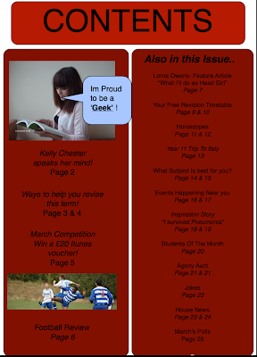
I have made sure that the colour of the font is the same throughout the cover and contents page, this shows continuity that makes a magazine look professional. However, the font that i have used is simplistic and shows no character, which could lead to a readers attention not being drawn to it.
It was important for me to include ideas from the focus group as it was a direct way of gathering ideas of what the target audience wanted. Although it proved difficult to include all of them on the cover, so i had to chose ones that i thought would attract the most interest.
I wanted the cover to look light hearted and fun so used bright colours ( one of the things the year 7's wanted). I also used features such as italic, bold and caps lock to highlight aspects and make them stand out.
To ensure that the contents page maintained a professional feel i spaced out subheadings so that the page didn't look to busy or cramped.
Overall i think the quality of my work will improve loads over the course because i will have more time to get used to the software, i'd like to be able to improve editing techniques, for things like the title so i'd be able to give the magazine its own unique feel.


good stuff holl :) the colour scheme's consistent and looks fun to read :)
ReplyDeleteYou have used the same font through the two pages which really links the pages together and the images you used are sharp and of good quality, which makes the magazine look more professional as a whole:)!
ReplyDeleteGood job Holly!
This is really good - it's consistent, clear and easy to read.
ReplyDeleteYup - good comments here and well done for posting up. But...
ReplyDeleteDon't be afraid to be more critical on each other's work - it'll only help you all in the long run.
First...
Don't use !
Ever!!!!!
No!
Really!!!!!!!!!!!!!!
They're an unecessary piece of punctuation!!!!
Also, make sure you've checked grammar and spelling before printing... Im a geek, or I'm a geek.
I'm not personally a big fan on centred text - I think it looks better set left and ragged, rather than justified and centred. It creates too much white (or red) space.
Also, (and I KNOW the software issues) watch your leadding. That's the space in a box above and below the text. There's more red at the bottom of CONTENTS than above it and this jars the eye.
Finally, with your cover - think about using swatches (if you can) or matching the colour of the door to a red. This would let you 'colour in' the bottom window and so you wouldn't lose part of your text with the bright glass.
On the whole though - a great start and well done! Keep going!