
Monday, 23 April 2012
33. Final Draft - Cover
Thursday, 19 April 2012
32. Second Draft - Double Page Spread

I feel as though i have made better use of the space on the pages. This is because i have moved the title; 'Your Festival Guide' to the centre of the page, whilst moving the festival features around it.
To heighten the idea of my magazine relating to a Scrap Book, i changed the back ground to a brown, arty looking piece of paper. I think this works well. In addition i think that it looks like my artical is personal, because of the scrapbook theme and because i have chosen a font that looks like hand writing.
When doing my second draft i found that the layout meant i had to comprimise. I had to get rid of the 'your vote' box and also the twitter and facebook icons.
I think that this draft can easily be related to Indie style, the colours and font have connotations of the genre.
31. Second Draft - Contents

I have changed the colour scheme however, this is because i felt that the pinks and purples used in my first draft were too feminine and didn't relate very well to my genre.
I have also made the box slightly translucent, i think this allows you to view the contents all as one piece, rather than just a picture and list. I have also added the magazine website to the contents page, this is because i noticed it in a magazine i annalysed.
In addition, i have changed the background picture. I didnt want the cover and contents images to look the same so i chose this one. I like the idea seeing my model from the front and then the back.
To improve i would try to brighten the picture some more. When i took it the weather was bad so the lighting is awful. I would also try to make the title 'Contents' stand out more.
30.Second Draft - Front Cover

I chose a wooded are as a background because it reminds me of music festivals. I also remembered that Indie music fans are stereotypically out going so i thought it would be best to take my photos out side.
So that the magazine looks professional, i chose a clear colour scheme and made sure that the font was continuous. In addition i have also added a barcode and the date of the magazines release in corners of the cover.
Ive placed the text where it is due to my background, although most of it is on the left side i feel that it balances it out so that the cover doesnt look too busy.
Wednesday, 18 April 2012
29. First Draft - Double Page Spread

Its was obvious that i had to continue the colour scheme i has used throughout, so i picked similar colours to my contents and cover. However i wanted my back ground to be quirky, so i chose a mint green that had a crinkled tissue paper effect. In addition i also used the fonts that i had included in my other pieces.
For continuity i made sure that i included the grey i used in the title on the first page, on the second page too, i feel as though it makes it look professional.
I felt that it was important to include logo's of festival in this, this is because i know that readers can look at the pages and know what the article is about without having to read it through.
So that it was visually appealing i ensured that i used plenty of images, this will catch the readers attention and reflect the feel that i want my magazine to have.
On my second draft i want to improve how the text is layed out.
Thursday, 12 April 2012
28. First Draft Contents edited
When taking a few more original photos, i decided to include some with my model holding a guitar. This is because i used it in my first draft and decided that it provided an obvious link to chosen genre.

27. First draft Contents
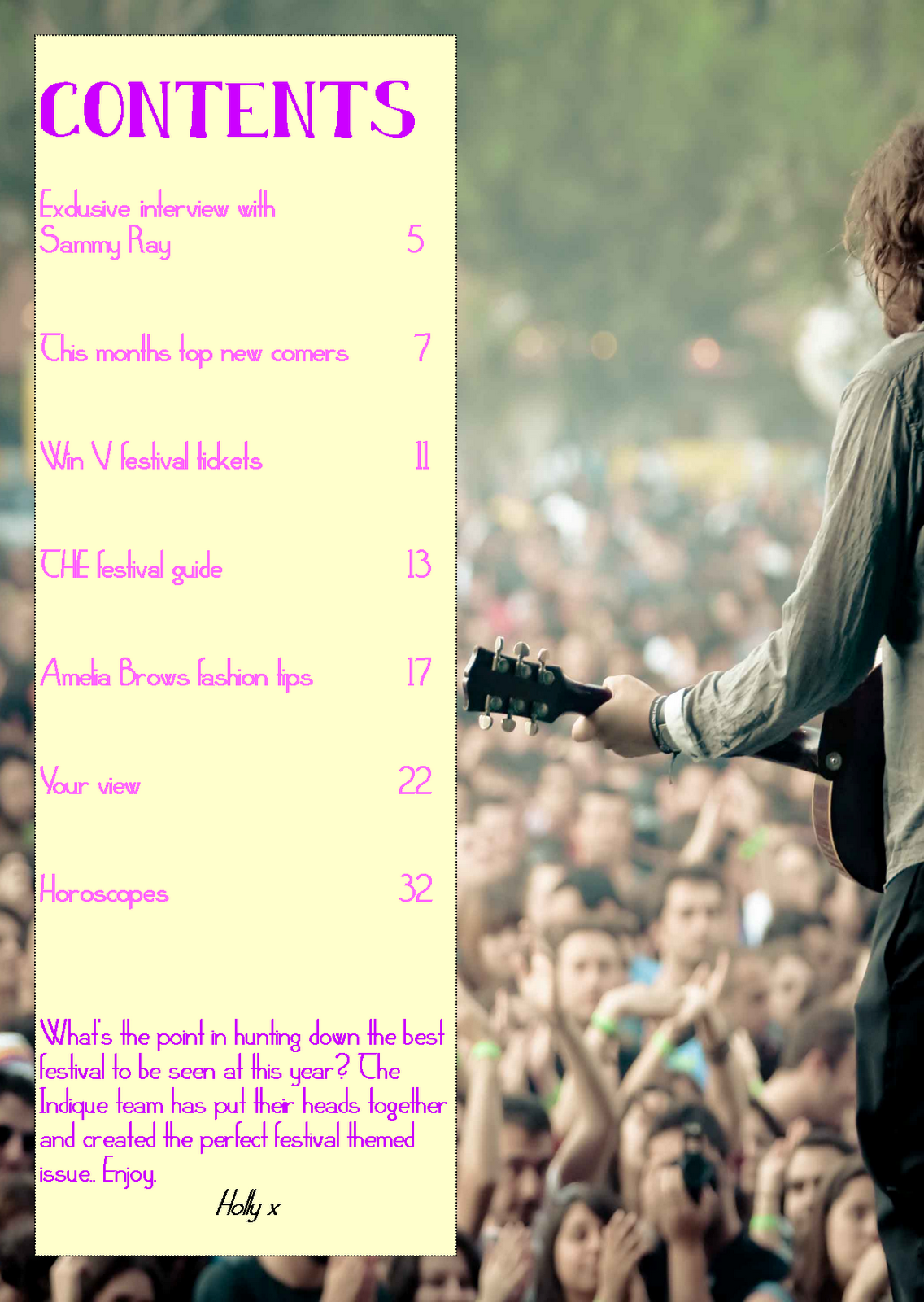
This is my first attempt at a contents page. I decided that it would be easier to complete the rest of my work on publisher, this is because i do not have a 'Mac' at home.
The background is an image of a male indie singer, playing his guitar to a large festival audience. I liked how the artist was the focal point of the image and how the audience was blurred. I felt that this would work well alongside the contents and uptain the quirky character that i wanted the magazine to have. I designed the contents so that it was in an orderly list down the left hand side of the page, this not only makes is easy for readers to identify what is included in the magazine, but also keeps inline with the 'sleek' theme i wanted it to have.
To ensure that there was continuity, i made certain that i carried on the colour scheme i used on the cover, this makes the magazine look professional and orderly. Secondly i made sure that i used the same font that i used for my title as i did writing 'contents'.
When writing what was included in the magazine i looked back at the Focus Groups i had done previously. The questions i asked provided me with answers that benifited me when creating the contents, they provided me with an insight of what a possible reader would want and expect from an indie music magazine.
I also added a 'letter from the editor' as after looking through magazines, i found that this was common and gave the magazine a personal and friendly touch.
Overall i am happy with this contents page, however i still think that i will be able to improve it in the time it takes me to do my second and final drafts.
Looking back at the colour scheme i've used, i've realised that i'm not very fond of it. I feel as though the connotations of bright summery colours link to much to girls and pop. I'm going to aim to change it in my second draft.
Creating this contents page has sparked off loads of ideas that i would like to try and see if they'd work as partof my second draft.
Subscribe to:
Comments (Atom)